


Filmmaking | How To's | New England
Learning from Classic Movie Poster Design
Written by Michael Jones | Posted by: erin
Have you ever judged a film by its cover? Shameful, but most of us have. We neglect countless classics as we walk down the aisles of our local video stores based entirely by a poor cover image. Sometimes the films that do grab our attention have the worst names in the history of film, but the artistic beauty of the cover is enough to sell us. As we get older some of our only memories of films can be through the powerful movie powers associated with them.
The images filmmakers use for movie posters remain a crucial part of their marketing strategy. When reflecting on days of decorating dorm rooms with there were constants: Someone always had a Pulp Fiction poster, someone always had a Clockwork Orange poster, and someone always had Animal House with John Belushi donning the sweatshirt that reads “COLLEGE” in bold white caps. Whether the poster consists of a screen shot, an animated caricature, or even just a symbol (i.e. the Batman logo), there is something about these particular posters that continue to stir emotions inside of each one of us today.
As a photographer, I pay particular attention to the images used in movie posters and packaging. If I were working with a filmmaker who was designing his or her own poster or DVD cover, I’d suggest taking a look at the classic film posters that have stood the test of time. To start this discussion, it’s best to have a brief look at one the best poster artists in the history of film.
Bill Gold is as close to an auteur as a graphic designer can be. His career began in the 1940s working for Warner Brothers on the campaigns for Yankee Doodle Dandy and Casablanca. In 1962, he created Bill Gold Advertising in New York City where many seminal film posters were imagined. Perhaps the reason his posters were so successful is that he understood how to use his art. By this, I mean he understood that on one hand he was creating a beautiful art pieces but on the other hand he was creating components that were building blocks for a larger advertising and marketing campaign. This is something that independent filmmakers should keep in mind.
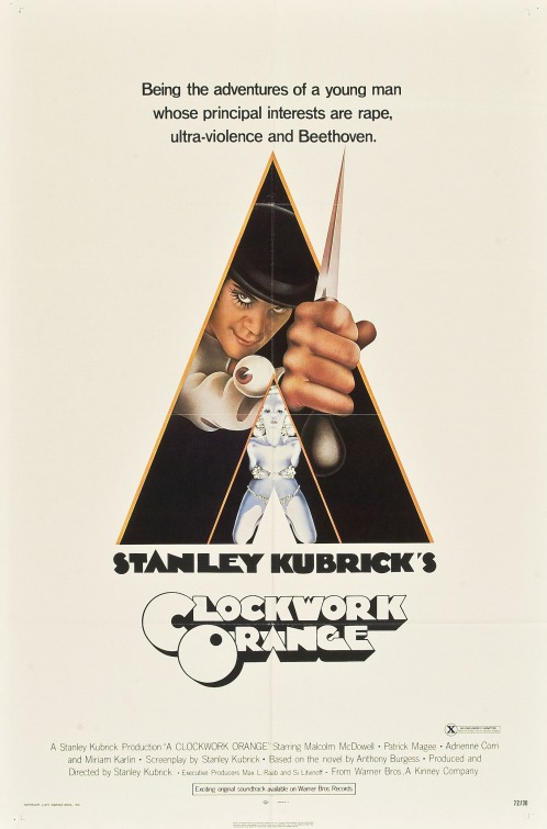
I particularly like Gold’s poster for Clockwork Orange. It is iconic in the strictest sense of the word. That same image has been reproduced hundreds of times and put on posters, patches, and t-shirts all around the world. This poster does what Kubrick does in the film: It takes a graphic subject and makes it visually appealing. The poster features an illustration of the film’s protagonist Alex during the open sequence as he sits with his head cocked at a peculiar angle before he recites the opening lines. Hidden inside the second triangle on the poster is a milk dispenser mannequin from the Korova Milk Bar that the characters frequent. To recap, Gold used strangely appealing images and slick design to create one of the most recognizable film posters.
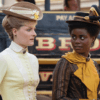
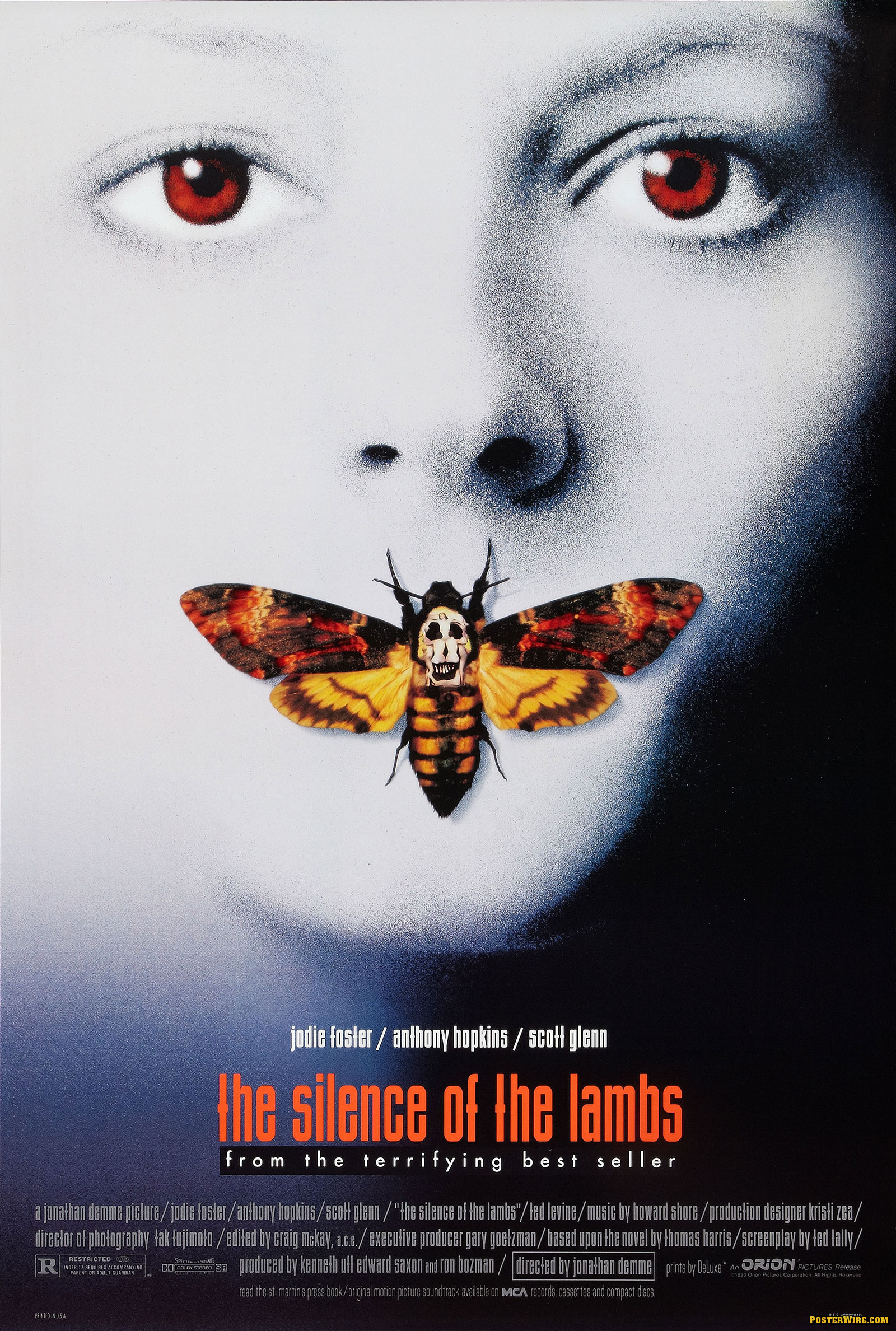
Sometimes the most original posters are the ones that appear to be the least original. When Vanilla Ice sampled Prince’s Under Pressure it caused a stir in music world. There were issues about pre-existing music being used, but more importantly for our sake, the original was altered to produce a different creative output. The poster for The Silence of the Lambs makes use of this same ‘sampling’ tactic. It is a close up of a woman’s head with some sort of killer moth concealing her lips. Attached to the moth is an oddly placed skull/death symbol. This is a nod to an old Salvador Dali portrait and actually includes part of the image from the original portrait within the poster.
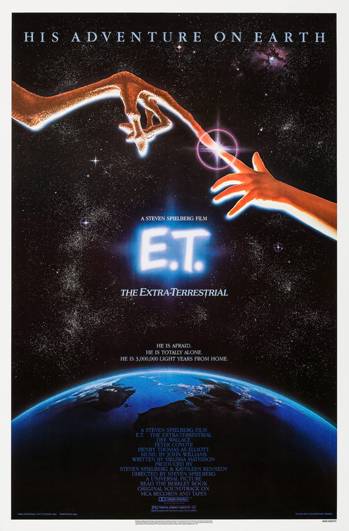
The late John Alvin did something similar with his epic poster for Spielberg’s E.T. The poster shows an extra-terrestrial finger touching a human finger. On the surface it appears to be just that, but after a deeper semiotic look at the image, it becomes clear that the image is a direct reference to Michelangelo’s famous work in the Sistine Chapel, God Creates Adam. While referencing and sampling are two different techniques, they are both equally strong ideas for stemming up inner-creativity. More importantly, the viewer has already seen the image before so the poster appears to be somewhat familiar. Giving the viewer a sense of familiarity can be a crucial tactic to creating a successful poster.
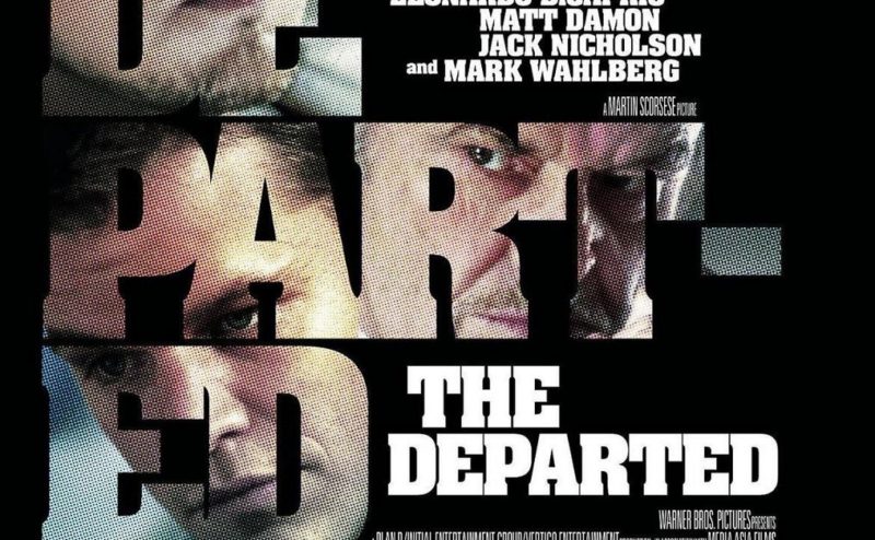
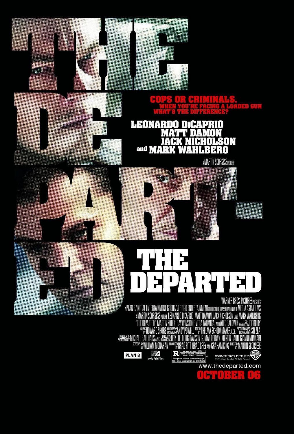
One way to do this is to use a technique that is almost as old as movie posters themselves. This practice is all about using the actors to literally sell the film. For example, the poster for the 2006 Boston-based hit, The Departed, uses the faces of three A-list actors, all with deep emotion embedded in their facial expressions. Just like the ‘sampling’ posters, this poster is effective because we are familiar with the actors and in addition, we tend to associate all three with quality films, thus we subconsciously are led to believe that The Departed should be great before we even know the extent of the plotline. This method has been used across the board from comedy to documentary. The classic John Grisham drama The Firm makes use of this technique by featuring a headshot of Tom Cruise. Enclosed in his head is a picture of him dressed in a suit running out of a building that looks like a court, offering a suggestive feel for the film.
With or without major stars, posters can succeed by capturing the mood of the film. In 1997, production crews bombarded the small town of New Canaan, CT to shoot The Ice Storm. While the poster isn’t going to win any awards, it is strongly effective from a visual art perspective. Each actor’s photograph is enclosed inside a rectangular box. The arrangement of the three boxes mimics icicles hanging from a building. The font used for the film title appears icy and the overall tone of the poster is stark, like a New England town in the depths of winter, which is exactly where the characters in this film are trapped.
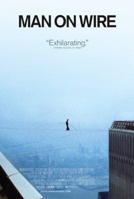
As a film aficionado with a background in photography, I absolutely love when a poster displays an intriguing still image from the film such as the one for the Oscar winning documentary Man On Wire. In terms of selecting which still to use, it is sometimes best to pick one that has space. In this case, minimalism speaks louder than posters that crowd the central image with too much text or visual information. The title stands out in foreground in a passionate black bold caps lock, followed by a quote by a quote from Stephen Holden of the New York Times that simply states, “Exhilarating.” The photograph of Philippe Petit balancing on a thin wire between the Twin Towers in 1974, risking his death for no monetary gain, is something that should inspire us all.
When piecing together a movie poster, it is important for one to understand the overall message of the film and to be able to convey that feeling only through the use of images on a single page. Before taking on that assignment, one might find ideas and inspiration from the images of the past.
‘How To Design A Movie Poster – With An Example,’ by Jacob Cass.
‘100 Greatest Movie Posters,’ by TC Candler.
www.impawards.com
'How To Design A Movie Poster - With An Example,' by Jacob Cass. '100 Greatest Movie Posters,' by TC Candler. www.impawards.com
