How to Promote Your Film Online
Written by Michele Meek | Posted by: Anonymous
You labor over lighting and camera angles, choose dialogue carefully, wring genuine emotion from your actors, and spend countless hours editing your film. But is that all? Unfortunately, that’s not the end of the filmmaking story, if you actually want people to see your film. In that case, you must also consider how to promote your film. This includes garnering press coverage, screening your film at festivals and theatres, and promoting your film through its own website. This last detail is one of the quickest and least expensive ways to get attention for your film. And it should be your first step.
A well-executed site for your film lends professionalism to your project and can be an essential tool for improving your chances at obtaining press coverage and festival screenings. Why? Because having an accessible website makes it easy for festival directors, journalists and fans to spread the word about your film. If you don’t have nice pretty high-resolution photos on your site, you make it that much more difficult for the press to cover your film. (Yes, we really are that lazy).
Having designed websites for a decade and having looked at hundreds of film websites in that time, I can tell you most of them are a sorry lot. There seems to be no correlation between the effort involved in the film and that put into the website — making for a strange assortment of wonderful films with embarrassing websites, lousy films with stunning websites, and everything in between. To help beautify the film website world, I decided to put together this article of tips, which if you follow will guarantee you compliments and, most likely, coverage on NewEnglandFilm.com.
How to Build Your Winning Film Website
Movies are a visual art. Similarly, websites are a visual medium. So the first thing that you need to remember is that it shouldn’t be ugly. This seems obvious, I know, but apparently not. In most cases, it’s simply a matter of knowing where your strengths do not lie. You may be a great director, but you may not be a good web designer. In that case, your best bet is to hire someone. This can be done within the same budget constraints and with the same payment terms with which you hire any other crew. Just remember marketing is not an ‘extra’ after-thought at the end. It’s an essential part of the process, and your website should be launched even before you go into production on the film.
Of course, the visuals are important to your overall impression of the site (and therefore, the film). But as a pretty film without a solid story leaves the viewer feeling dissatisfied, an attractive site without the necessary content is fairly useless. You should consider who will be visiting your site and why they are there. For films, it’s typically fairly straight-forward — viewers, festival directors, potential distributors, press, cast and crew will hopefully visit the site. The reasons vary — to learn about the cast and crew; to learn more about the film; to find out where to see or how to purchase the film; or to access promotional materials for the film.
Once you know and understand your audience, your task becomes much easier. It becomes obvious that you need:
- Cast and crew bios, photos and links
- Summary of the film (both short and long)
- Screening and festival dates (past and future, preferably)
- Clip(s) or trailer(s) of the film
- Press details (previous coverage and press releases/statements)
- Photos (print and web quality)
- Contact information
- Links (this is important so you have a place for reciprocal links)
Don’t forget that once you combine the beauty and brains to create your wonderfully well-balanced website, you are still not quite done. You still need people to find the site. Here’s where you encourage any and all sites to link directly to your site. The first step is to make sure you have the title name on the page (in text) and that it’s the title of your home page. This will help search engines like Google index your site properly. The first two places I would go to list my site would be the Google Add URL page and IMDB.com Add a New Title page. If you’re a New England filmmaker (born, raised, educated or lived in the region) or working on a film made in New England, then you can add your title to the NewEnglandFilm.com Local Films directory. Search engine ranking and site promotion is an article (or website) in and of itself, so I’ll leave it at that for now.
Seeing How It’s Done…
But maybe the simplest thing is to look at some examples and analyze what’s missing or working on each.

The website for the local film Divorce Lemonade.
[Click to enlarge]
I love this film. But unfortunately the same attention that was given to the simple, creative and powerful short film Divorce Lemonade was not given to its website. A few immediate visual problems strike me as most obvious — the home page is too cluttered and a bit random feeling; up/down scrolling is necessary on the home page; and the words "a film by Justin Hayward" are in miniscule text at the very bottom of the page.
There are a few more unfortunate flaws. The fact that the film was featured in Sundance is buried on the bottom of the home page, so most visitors wouldn’t discover this unless they clicked on the ‘festivals’ link. The home page also has a counter which when I visited stated ‘851’ viewers. Unless you have over 100,000 views, you should never list a counter – it’s embarrassing. Another noticeable flaw (and one of my personal pet peeves) is the skimpiness of the ‘press’ section. It links to one article and features one tiny photo. There are no print quality photos, no press releases, although I did find a trailer after staring at the site long enough for this article. Ironically, the full film is available to view online but you would never know it from their website. All in all, a great film with a website that doesn’t do it justice. It is good to know, however, that it’s not necessary to have a great website to get into Sundance. Grade: D

The website for the film The French Guy.
[Click to enlarge]
It is immediately clear that this site for The French Guy was professionally designed. First of all, it uses Flash software, which according to Macromedia’s survey, works on over 98.3% of web users’ computers. However, I wouldn’t recommend Flash software in general for web design. Although it gives the designer more control over the look and feel and has some high-tech features, it causes some problems. For example, text can not always be copied and pasted (which is useful if someone wants to use your bio information or copy the summary of your film). Even worse, each page cannot be bookmarked separately. So whether you bookmark the press page, the news page or the story page, the link is still to the home page.
On the plus side, this site is a welcome rarity in that it has a plethora of marketing materials for download — a one sheet, director notes, photos from the film and a photo of the filmmaker. In addition, it features all the other material that a film website should — a trailer, bios of cast and crew, a list for screenings (although personally I would have called that ‘screenings’ instead of ‘news’ which is a bit misleading), and a story summary. Overall, this website is a relief to stumble upon. The navigation is clear; the design is welcoming; and the content is well-thought out — basically it’s got good bones and the meat too. Grade: B+

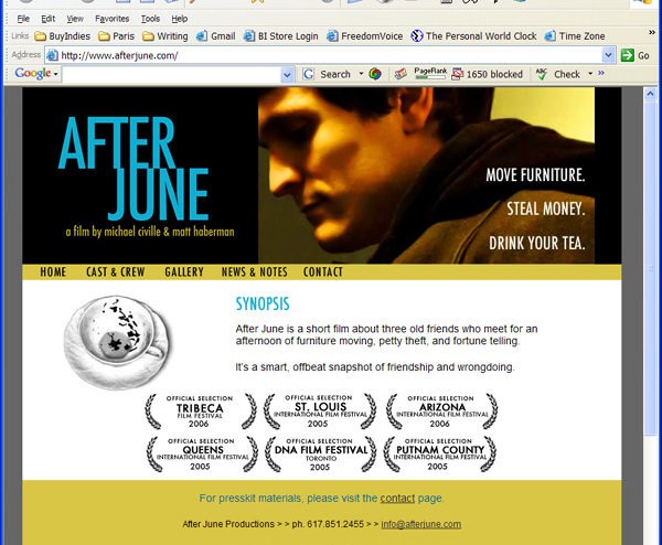
The website for the film After June.
[Click to enlarge]
This website for the film After June definitely gains extra points (with me, at least) for not relying on fancy web technology to present the necessary materials in an aesthetically pleasing manner. The home page features a large image which nicely captures the mood of the film. Plus, this page features exactly the content it should in the space it should — the title, the director/producer names, tagline, brief summary, and navigation. The festivals presented graphically work well and immediately give credibility to the film.
Throughout the site, we find the key materials — cast and crew information, screening dates, photos, etc. The clear and simple navigation make it simple to find what you’re looking for (other than the fact that press materials are somewhat buried on the contact page).
The number of photos in the gallery is wonderful — there’s a choice of production action shots, as well as striking production stills. The only downside here is that you can’t click on each to make it high-resolution. As it is now, the print press can only download print-quality versions of one production still and the film poster.
Mostly this site is soothing to look at — it has the right balance between text, image and white space. Perhaps that’s why the News & Notes page stands out so much to me. It’s quite scattered in comparison. Also ‘news’ ideally shouldn’t be more than a month old. Right now, they are listing news from February 16, over a month after the fact. On the Internet, news gets old fast. Perhaps ‘screenings & notes’ would have been a better chosen phrase. Grade: A-
The Quick Rundown: Do’s & Don’ts
- Do create a clear navigation system that is consistent throughout your site.
- Do make it simple for potential readers to contact you via phone, mail or email.
- Do include the essential information necessary for all film websites.
- Do make sure that your site is accessible through different browsers by testing.
- Do list your site with all the major search engines and include meta tags.
- Do get a professional to help you with navigation, layout & design.
- Do try to get outside links & do any additional promotion for your film/company.
- Do not have cluttered, overwhelming pages.
- Do not have outdated information on your web site.
- Do not have pages with huge graphics – they take too long to download.
- Do not use frames – they don’t work on old browsers and are terrible for bookmarking & search engines.
- Do not try to be cutting-edge only to turn away visitors who don’t have the latest software and plug-ins installed.
- Do not use generic graphics that look unprofessional.
- Do not think that by putting up a web page, you will magically attract millions of visitors.
NewEnglandFilm.com hosts and designs websites. See the webfolio for more information.


